It’s Go Time! The New Lovely Geek is Here!
Note: If you follow me via RSS make sure it’s pointing to http://feeds.feedburner.com/thelovelygeek. My old feed url may be broken because I recently updated my url to https://.
Hi friends! Today I am excited to reveal the launch of my updated design at TheLovelyGeek.com! I’ve been working busily behind the scenes for quite some time on the new design (hence the lack of blogging), so it’s a great feeling to finally launch it! Let’s take a tour!
A Simplified Navigation
When I first launched The Lovely Geek I had all these ideas for different pages. When it came time to redesign, I looked at my stats (HotJar and Google Analytics) and found that a lot of those pages were not getting traffic. I also wasn’t doing the best job of keeping the content up-to-date.
I pulled back and decided to keep it simple. I either condensed pages or omitted them altogether, making the actions on the site straightforward.
The Lovely Geek Design Studio

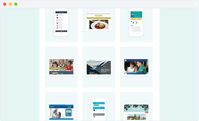
I put a little more love into the Studio section of my site this time around. Instead of pulling in my work directly from Behance (via a plugin), I’m showcasing a selection of my most recent design work that I’m really proud of. Since I work full-time as a UI/UX Designer, I felt it was important for me to have a portfolio section of my site, especially since I might be speaking at WordCamp again this year. 🤞🏼
Shopping?

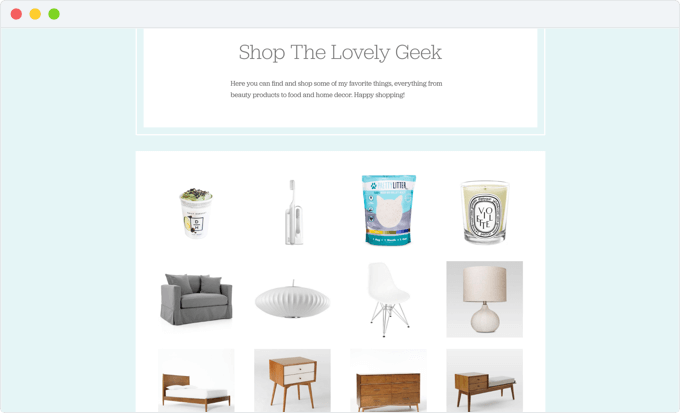
Yes, I have a Shop page. If you’ve ever wondered what products I use whether it’s food, beauty, home furnishings, or the tech I use, you can find it (most of) there. Everything that’s in my store is items I use AND love. They’re affiliate links which means that I may receive a commission on sales of some products that are linked to. One of my goals with my blog this year was to start monetizing the site, and this is just one of those ways. I’m still in the process of adding more items, but there’s a good chunk to start!
Lighter Color Palette
The previous design was very colorful, and while I loved it, it may not have been for everyone. In fact, I’ll never forget the reaction I got when I showed it to another potential client who was also a lifestyle blogger. While the design was nice, she said it wasn’t her taste being that it was too colorful. 😳
In this redesign, I paid attention to what other lifestyle bloggers were doing, and a majority of them had very minimal light color palettes. This allowed their content to shine and not cause visual overload. I took these same concepts and applied it my new design. More white space, light on color, and better readability.
Colophon
All the design work was done in Sketch. The type is still the same (Jubilat and Brandon Grotesque), just using it in slightly new ways. Supporting tools and resources came from Sketch App Sources, All the Free Stock, 0to255, TinyPNG, and many more along the way.
The site was built completely from the ground up using the Plate WordPress Theme which is based on the Bones theme that I’ve used for years. I love it because it contains all the WordPress classes and IDs making it easy to customize things without creating extra bloat; you’re using what’s already there. It also keeps my coding skills fresh every time I dig in! You can check out my theme build on GitHub.
Of course, if you find any bugs and are feeling really nice, please shoot me a message!
You Might Also Want to Read...

Note: This article may contain affiliate links. I only link to products that I know, love, and use. For more info, please view my disclaimers.
JOIN the LIST
Subscribe and stay up to date with the latest blog posts.
JOIN the LIST
Shop My Posts
Want to know where I get #AllTheThings from my blog or Instagram posts? Find what you're looking for below (or just ask).
LIKETOKNOW.IT
Amazon store
Everything looks great! I love the simplicity. However, I do admit I miss seeing dates on each post on the front page. Awesome job, Cristina.
Thanks, Carolynne! I chose not to have the dates on the front page because I didn’t want it to hurt the impression of my content being stale or out-of-date. I’m curious, how do you see value to having the dates on the homepage? I’d love to hear your thoughts!
Super beautiful! Love the colors and clean design <3
Thanks, Melly! Any chance we’ll see a site from you in the near future? 😉
I love the new look! Very fresh and clean. I did actually like the colourful look before… honestly I wouldn’t change a thing about my blog if someone hated the colour 😆 But I can understand the *eep* feeling you might get when someone gives you that kind of feedback!
I kind of took the focus off too much colour on my blog too, haha. My intention wasn’t really to allow the visuals to stand out, but simply embracing a simple look. 😄
Your colophon made me realise I didn’t put any technical details into how I built my theme haha. I might go and edit my post 🙈
Also love that we published a new look to our blogs at pretty much the same time!
Thanks, Georgie! Haha didn’t we do this last time around too? I feel like when I launched my site two years ago you had launched a redesign right before I did. 😆