User Experience
In this class, we basically learned about what not to do in web design, as well as how to explain to clients why you don’t do these things. We explored many different sites and examples of good and bad user interfaces, some of which we redid for assignments.
Our first assignment was to find examples of web sites that made it difficult to use and web sites that were easy to use. Denny’s (nice design, terrible navigation; even Smashing Magazine agreed with me on this), Bed Bath & Beyond, and Google’s mobile version of Google Reader were my examples of poor user friendliness. Flickr and Old Navy I praised for their ease of use.
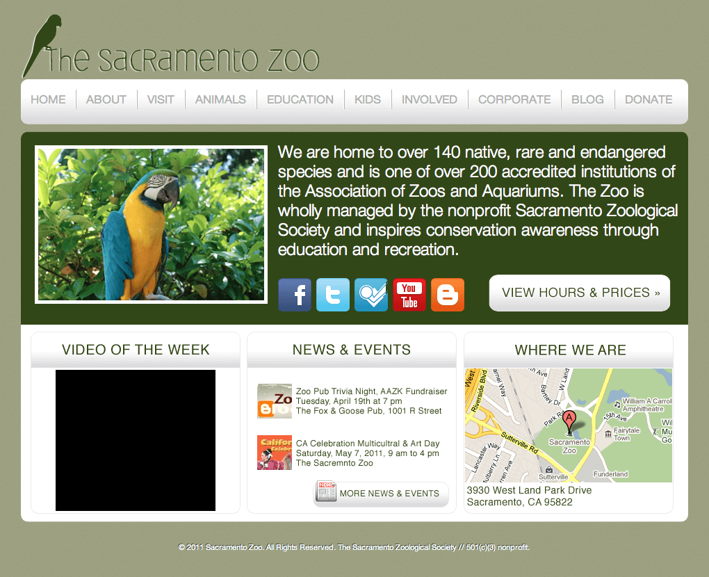
Next assignment was to redesign the Sacramento Zoo’s web site:
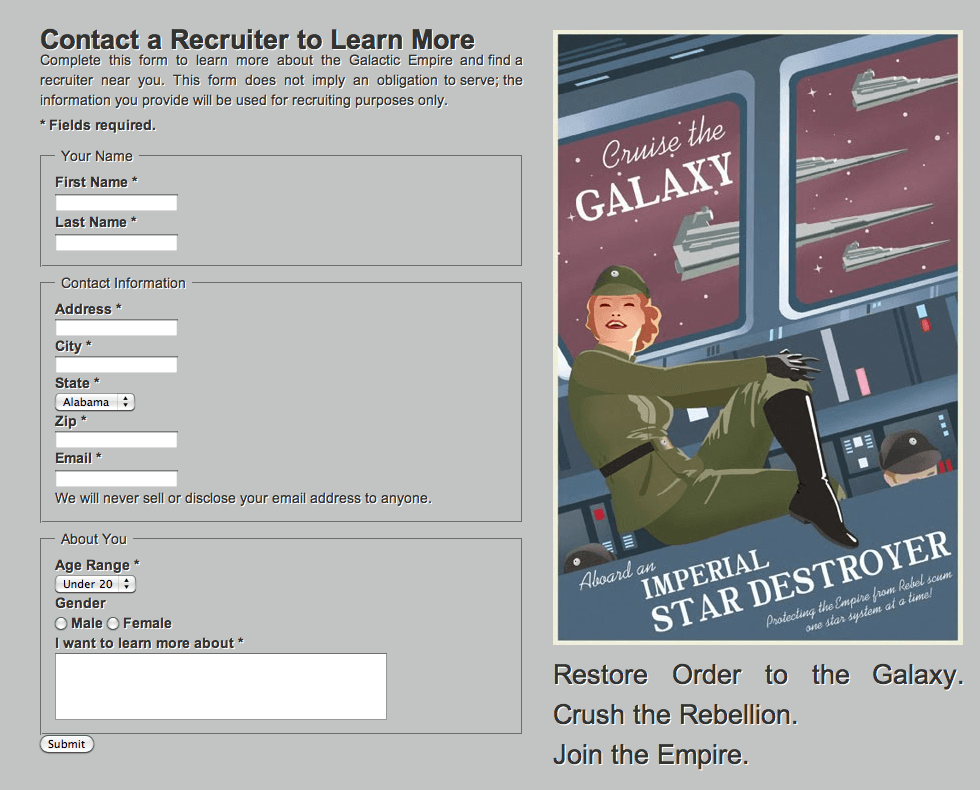
Our last assignment involved creating a simple user-friendly form. After the whole lecture about good and bad form use, I now find myself critiquing sites anytime I have to fill out a form.
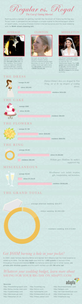
The last major assignment in this class involved infographics: we could either make our own or redesign a current one. I chose to redesign the infographic comparing the average American wedding to Chelsea Clinton and Kate Middleton’s wedding.
Note: This article may contain affiliate links. I only link to products that I know, love, and use. For more info, please view my disclaimers.
JOIN the LIST
Subscribe and stay up to date with the latest blog posts.
JOIN the LIST
Shop My Posts
Want to know where I get #AllTheThings from my blog or Instagram posts? Find what you're looking for below (or just ask).
LIKETOKNOW.IT
Amazon store