Portfolio 2
After taking Portfolio I back in September and watching my friends graduate, it was finally my turn to take Portfolio II.
Portfolio I/Portfolio II are required classes students take their last quarter right before they graduate. If you’re in the associates program, Portfolio I is the only one you take. If you’re in the bachelor’s program, you take both with Portfolio II during your last quarter. Both prepare you to get everything you need in order to participate in the end-of-the-quarter Portfolio Show where graduating students display their best work in hopes of getting hired.
This quarter I pushed my branding further and redesigned everything. After all, I mentioned in Portfolio I, “Will this be the same when I graduate in June of 2012? Probably not. I intend to push the design further.” My logo, business package, and site all got a fresh new face.
The Logo
Before – My logo from Portfolio I
The typeface is CAC Pinafore using Trebuchet MS for the “Design” part and glasses designed by me. The concept behind this logo was to find a typeface that was similar to my handwriting while looking for a mark that symbolized being a girlie geek.
I went through many different concepts (brackets, argyle, hearts, a mouse arrow in the shape of a girl, etc.) before I ended up using glasses enclosed with brackets; I felt both represented me perfectly. Glasses symbolize geeks/nerds (plus I have a thing for glasses, hehe) and the brackets tribute to the coding I do as a web designer.
After – My new logo

When Anna Wintour, editor-in-chief of Vogue magazine, accepted the 2011 Webby Peoples Voice Award for Fashion, her speech was simple: “Sometimes… geeks can be chic.” That was the driving force behind my new logo.
The typeface is Mishka by Emil Bertell with glasses designed by me. This time I wanted to go with something that was more elegant, really emphasizing the “lovely” out of Lovely Geek. Out of all the other typefaces I looked at, Mishka was exactly what I was looking for.
I changed the glasses slightly, so they matched the typeface I chose. I simplified them because another classmate remarked that my old glasses looked like a bra. 😛 Then I began exploring the concept of adding different kinds of brackets around the glasses, depending upon the item; for example, I’d use curly braces { } around the glass for print material, greater than/less than brackets for the web, and so forth, but I moved away from the brackets seeing as several people began copying that concept from me. Instead I integrated the glasses with the typeface.
The Business Package
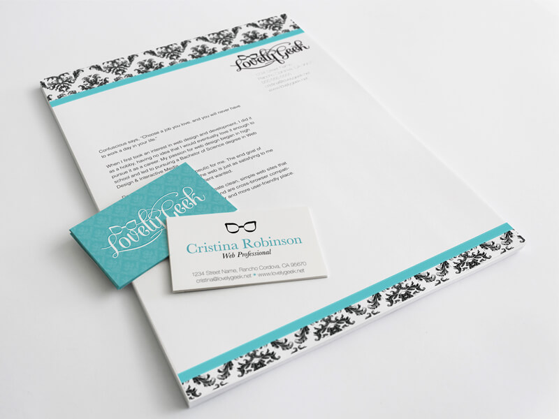
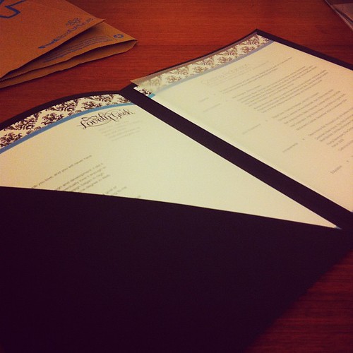
Since Portfolio I, the business package requirements slightly changed. When I took the class we were required to have a folder with our résumé, letterhead, envelope, and business card. The problem with the letterhead was no one really knew what to put on it, so last quarter they changed it to where you’d write an artist statement on your letterhead instead.
This time around, I also had to meet with career services to build my résumé, fill out forms, and write my artist statement. Luckily my résumé was in really great shape (just a few small edits), and I nailed my artist statement. All I had to really focus on was incorporating my branding with it.
By the time I got logo nailed down, I decided for the color scheme I wanted to go in a Breakfast at Tiffany’s type look, using blue/turquoise, black, and white in my branding.
- Folders – GBC Cover Letter Portfolio from Staples
- Labels – Martha Stewart Home Office Metallic Labels
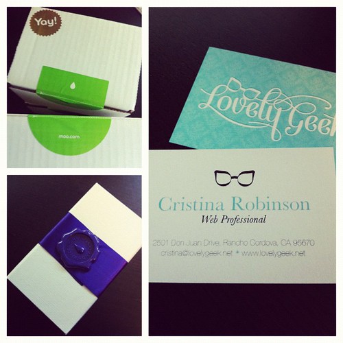
- Business Cards – Moo Cards
- Envelopes – Zazzle
- Resume & Artist Statement – Printed at FedEx Office
The Leave Behind
My leave behind from Portfolio I was originally going to be keychains using keyboard keys that would spell out things like HTML, CSS, PHP, and whatnot, but after running out of time that quarter I ended up just putting my résumé and some screenshots of my work on a CD.
This time around, I was on the path of looking at wedding favors and seeing how I could make it less bridal and more geeky. After all, I figured going the wedding favor route was a cheap way to go bulk and nice. I also was very adamant about making sure that whatever my leave behind was it wouldn’t be your average SWAG that people forget about.
After asking different people, the reality was most people were inclined to have a positive reaction to a leave behind if it had something to do with food. And considering this would be the first year culinary wouldn’t be required to have food at the Portfolio Show, the odds were definitely in my favor if I provided something edible.
My first idea was cookies because I bring homemade cookies into the office, especially when we’re having important in-office client meetings, and everybody LOVES them. But, someone in my class noticed the success there and was planning on brining cookies in because if I can make people happy with cookies, they can too. Can you tell I’m getting tired of copycats? ????
In the end, I decided to go with homemade fudge, as in the homemade fudge I make for everyone around the holidays. My sister suggested fudge because, “That’s your thing! You make fudge for everyone, and it makes them happy!”
Since I was going with the whole Breakfast at Tiffany’s type theme, I wanted to do something similar to Tiffany boxes. Not only would it match my theme, but the color would go well with the black table I’d be displaying my stuff on. While both Party City and Michael’s had “Tiffany boxes” neither one of them came with ribbon, which I didn’t feel like having to buy and cut separately. Instead, Party City had these turquoise popcorn type boxes that came with a small cellophane bag and ribbon. Plus I could put a sticker with my logo on them.
You Might Also Want to Read...

Note: This article may contain affiliate links. I only link to products that I know, love, and use. For more info, please view my disclaimers.
JOIN the LIST
Subscribe and stay up to date with the latest blog posts.
JOIN the LIST
Shop My Posts
Want to know where I get #AllTheThings from my blog or Instagram posts? Find what you're looking for below (or just ask).
LIKETOKNOW.IT
Amazon store
