My UI/UX Designer Toolkit
When the results came out for the Design Tools Survey, it was fascinating to see what the industry standards were and how I as a designer compared. In my industry, it’s so easy to fall behind, so I’m happy to see I’m right on track.
Here’s a look at what’s in my own designer toolkit and a peek inside my process.
Brainstorming + Wireframing
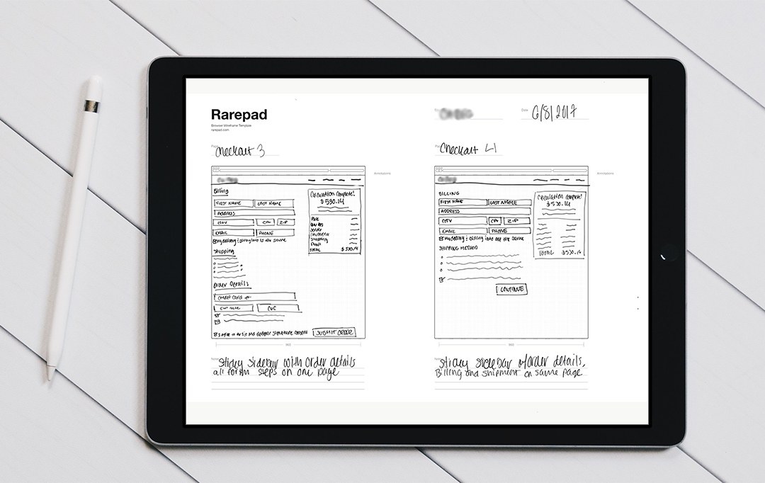
I start with pencil and paper. It’s the quickest and easiest way for me to get concepts out, especially if I have multiple ideas. I keep a Moleskin on hand for when I want to quickly sketch out a concept to use for later. I’m a big fan of Rarepad and the 960 Grid System PDFs which I’ll either print out or bring into Adobe Photoshop Sketch on my iPad Pro.
When I’m sketching, whether it’s on my iPad or on paper, it’s usually low-fidelity wireframes.

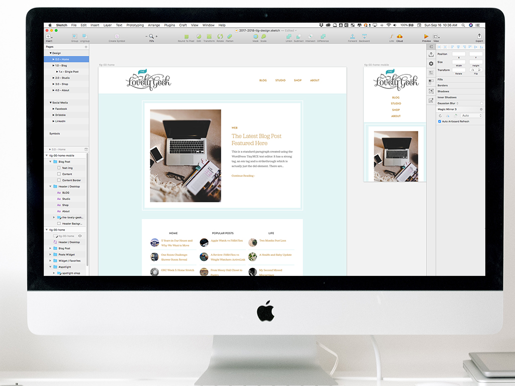
Next, I’ll turn my sketches into high-fidelity wireframes in Sketch. I found a pretty basic wireframe template that I’ve been using over the years and it gets the job done. The point of wireframes is making sure that all items on the page are accounted for and in the right order. I’ve learned to not get too fancy in wireframes because you have to think of them like blueprints of a house – you’re not painting yet. 😆
Interface Design
There was a point and time in my career when I was doing all of my design work in Photoshop. That was until I was introduced to Sketch. While Photoshop has done its best to keep up with Sketch, gone are the days of using it for designing websites and apps.

My dad always told me to use the right tool for the job, so these days I’m using Sketch for the bulk of my design work. If I need to do more specific image manipulation I’ll use Photoshop, for vector work I’ll use Illustrator, and for documentation it’s InDesign.
Here are a few other tools I use during the design process:
- Frank DeLoupe Color Picker – Let’s you color pick from ANYWHERE, not just the browser. You have the ability to connect it to Photoshop, so if you pick a color and Photoshop is open it will set your foreground color to that. It’s by far my favorite color picker tool.
- Icon Jar – You know all those icon packs you’ve probably downloaded over the years? Well, Icon Jar lets you organize them into a nice little library. You can import PNGs, vectors, even fonts, and it makes it so much easier to see what you already have.
- The Noun Project – My top resource for icons. They have a fantastic desktop app that makes it easy to search, drag, and drop into your design program of choice
- Paparazzi! – One of my go-to apps for taking screenshots.
- Sketch App Resources – A fantastic library of resources and assets to use in Sketch
- Astropad – My new favorite tool! It turns my iPad into a graphics tablet for my Mac
Prototyping & Handoff
Once my designs are complete and ready to show my clients, I’ll pop them into InVision, my prototyping tool of choice. I use InVision for websites, mobile apps, and mood boards. I really like the ability to add sections within a prototype so that way I can showcase the rounds of design. It’s also a nice way for clients to get a preview of how the design is going to function once it goes into development.
Along with InVision, I use the plugin for Sketch, Craft. Not only does it have some helpful content populating features within Sketch, but it also allows me to easily sync up my artboards to my InVision prototype.
When I hand off a design to a developer, I’ll give them the link to the InVision project as well as links to the Sketch file. I’ve tried using tools like Zeplin for handing off design assets to a dev, but I’ve found it’s a lot easier to create a style guide within my Sketch file.
File Management
I use both Dropbox and Google Drive. At home, I primarily use Dropbox (I have the Plus plan). I’ll use Google Drive too, but it’s more when I need to create a document to share.
At work, we have the G Suite, so it makes more sense for me to use Google Drive. Collaboration is a lot easier this way too. That and I’m able to keep work stuff separate from personal projects.
Development
Once my designs get into development, the code is kept on GitHub. I use a combination of the terminal and the GitHub Desktop app.
I’ve used a lot of text editors over the years, and I prefer Panic’s Coda, hands down. I use Panic’s Transmit for FTP as well. For compiling I use Codekit.
I don’t do a whole lot of development these days. It’s mostly frontend on my personal projects, whereas at work it’s in the hands of my very talented peers.
👩🏻💻
It’ll be interesting to see what the survey says for next year and how I can compare. If you have any recommended tools that I should check out or would like to share what’s in your designer toolkit, I’d love to hear from you in the comments!👇🏻
You Might Also Want to Read...

Note: This article may contain affiliate links. I only link to products that I know, love, and use. For more info, please view my disclaimers.
JOIN the LIST
Subscribe and stay up to date with the latest blog posts.
JOIN the LIST
Shop My Posts
Want to know where I get #AllTheThings from my blog or Instagram posts? Find what you're looking for below (or just ask).
LIKETOKNOW.IT
Amazon store
