The Lovely Geek Studio: Now on Showit
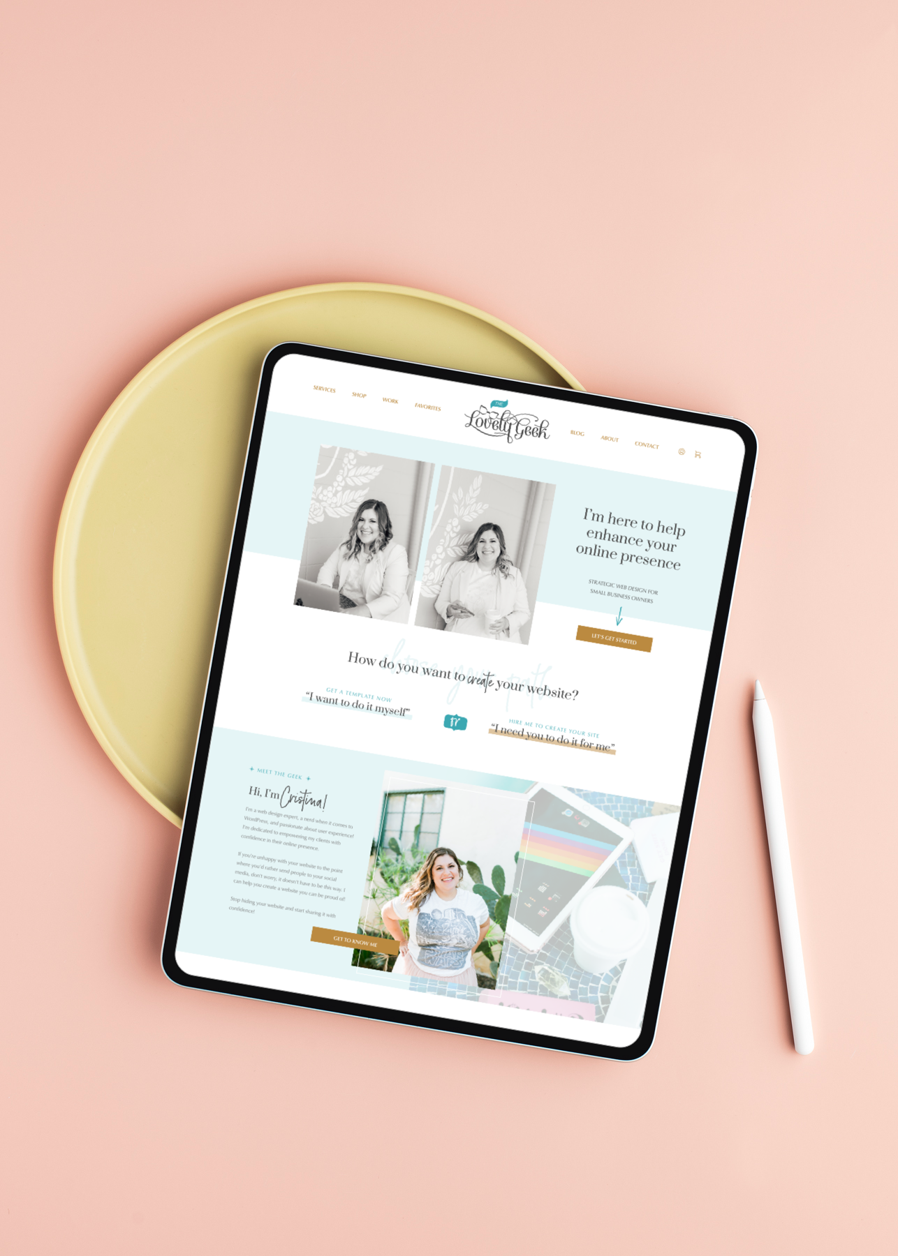
The day is finally here! The NEW Lovely Geek website is officially launched!
When I first started this site it was first and foremost a blog. In 2019 things took a shift to where my web design services became desirable, and I knew I had to make changes to better position myself. But between a new baby on the way and still working a full-time job, it was hard to fit a redesign into my already very busy schedule.
Into 2020 I updated pages here and there, but I wasn’t satisfied because I felt like I was being rushed. Every client opportunity that didn’t work out was a chance to tweak my site in a way that wouldn’t waste anyone’s time. I really wanted the chance to sit down and do a redesign right.
Once I found out I was pregnant again, I had to take action even if that meant putting potential new work on hold. I had to buckle down and get both my business and website in good place to be prepared for the unknown of life with two littles. I shared my plans for 2021 at the end of 2020 including a shift in my business. At the beginning of the year I put up a Coming Soon page and got to work.
Now, after many late nights, nap times, and early mornings it’s done! 😅 Let’s take a tour!
Services
One of my big takeaways from 2020 was just because I could do all the things didn’t mean I wanted to (or should). With limited time due to motherhood, I had to be honest about what I really wanted to spend my time and talents on. That turned out to be designing and developing websites.
This is why under Services you will strictly see my web design services. Originally I had an option for Creative Retainers, but I realized that’s a service I want to offer to my clients after they’ve completed a web design project with me as opposed to a new service.
Last year I had WordPress as a third option, but talking with potential clients showed that their needs fell between Squarespace or Showit. A full WordPress site was actually too much for them. Since Showit makes it much easier to create a WordPress site, I removed just WordPress as an option so now you either get a custom design with Showit or a template-based site with Squarespace.
You’ll also see my pricing, which I am not afraid to share. If someone is simply shopping for a web designer solely based on price and passes over me because I’m “too expensive” then that’s fine, they’re not my client. I’m okay with that. 😊
Shop
The shift in my business is I’ll be offering Showit templates for purchase in addition to my 1:1 design services. I wanted to present a more affordable option to “working with me” that can function year-round, not just while I’m on maternity leave.
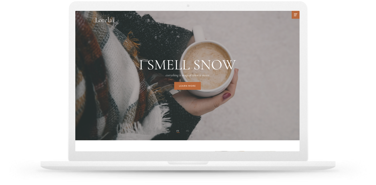
My templates are inspired by the ladies from some of my favorite fandoms. It should come as no surprise that I started working on a template called Lorelai last fall (while watching Gilmore Girls for the millionth time) before I even started my own redesign.

My goal is to release two templates a year. My two for this year will be Lorelai and Margaret with Lorelai launching in the upcoming months. Stay tuned!
Work
Any designer knows the struggle to keep their portfolio updated which is why I made sure that my latest (and best) work was featured. Not only do I have some of my latest projects featured, but I also have some pieces from my time working for my previous agency.
Favorites
This page was the hardest for me to design but the most rewarding once I got it done. Keeping track of #allthethings plus deciding how to organize them was a huge task! But now I have a spot for all my affiliate links, business tools, home sources, and more. I’m particularly proud of how the Shop My Home section turned out.
Blog
The blog got a major overhaul and is still a work in progress. I’m taking the opportunity to clean up and archive a lot of my old posts that are no longer making sense for my brand. Sure it’s fun to look back and see how the landscape of blogging has evolved, but let’s face it. There are some posts like those I did during my NaBloPoMo times that are not quality content pieces. I’m also going back through and updating the featured images.
I added a slider to the blog making it easier to view my content by category since I cover a wide variety of topics. Maybe you’re following my motherhood journey or perhaps you’re more interested in my business/industry-related posts. Either way, I’ve made it a little easier (and more visually interesting) to puruse through those posts.
I have a dedicated email I send out to my blog subscribers alerting them when there are new posts each month. Now, I included the sign up form on the blog as opposed to hidden away on a separate page.
About
I had a lot of fun designing this page and including a lot more of the lovely photos from my brand photoshoot last year. It was important that this page communicate more of who I am, what my credentials are, and what to know about me as a person.
In the wake of George Floyd and everything that transpired in 2020, I found it more crucial than ever to put up my values and what I believe in on my website. I can’t in good conscience take on potential clients that don’t align with basic human rights (it’s most definitely a red flag 🚩if a potential client comes to you wanting you to help them with Parler 👀).
That being said, I’m not shy about who I am, and I certainly acknowledge I am not for everyone. 😊
Contact
My old site had two options based on what you were trying to contact me about, but since the focus of the new site is to book my services I streamlined this page a bit more. Since I am not taking on any new work until the fall, I currently have a waitlist for people to join if they are interested in my services. Meanwhile, they can learn a little bit more about the basics of working with me.
Link in Bio
Have you read my post on why you don’t need Linktree or any type of link in bio service? You can make your own, which is what I did, and this redesign allowed me a little more control on mine.
Colophon
The biggest change for this redesign is how it was built. My website is now powered by a combination of Showit + WordPress. I have a post coming soon on why I made the switch from a fully-hosted WordPress site to Showit, but the biggest reason was control over design.
All design was done first in Sketch. With how Showit works, I wanted to make sure I designed every page before building it. When it comes to working on my own stuff I have a tendency to start in Sketch and then design in build, mainly because I experiment with what is possible and what I’m capable of building. This time around I wanted to make sure my build was in line with my designs. Plus it helped make the build go a lot quicker.
Back in September, I got together with one of my favorite local photographers, Christina Thomas, for a brand photoshoot. Now those images are sprinkled throughout the site making it feel more like me. Other images are from Social Squares and Unsplash.
Overall I’m really happy with how this redesign turned out. There are still a few things I am working on, mainly related to the blog, but as a whole, it’s looking pretty good. 😉 If poking around the site you find anything weird 🪲 feel free to DM me on Twitter or Instagram.
You Might Also Want to Read...

Note: This article may contain affiliate links. I only link to products that I know, love, and use. For more info, please view my disclaimers.
JOIN the LIST
Subscribe and stay up to date with the latest blog posts.
JOIN the LIST
Shop My Posts
Want to know where I get #AllTheThings from my blog or Instagram posts? Find what you're looking for below (or just ask).
LIKETOKNOW.IT
Amazon store