A few days ago I was chatting with a friend about our new home and how we’re still getting used to having a lot of space. Case and point: our bedroom.

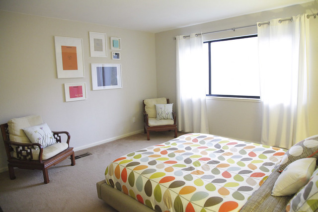
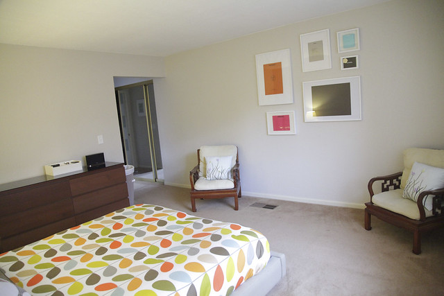
Our bedroom was the first room we painted, so it didn’t get too much attention afterward other than my luxury shopping bag wall. It’s a bit empty.


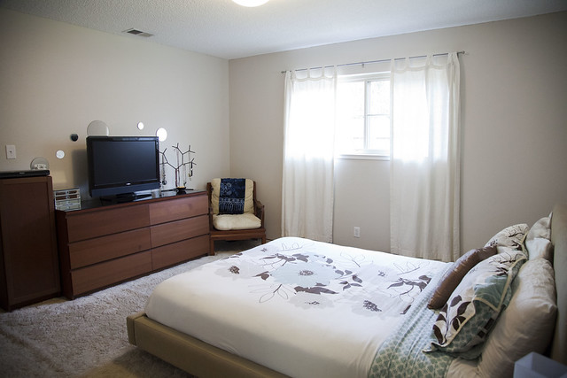
Layout has also been an issue. When we first saw the house we just figured we set it up similar to how we had it at our rental.

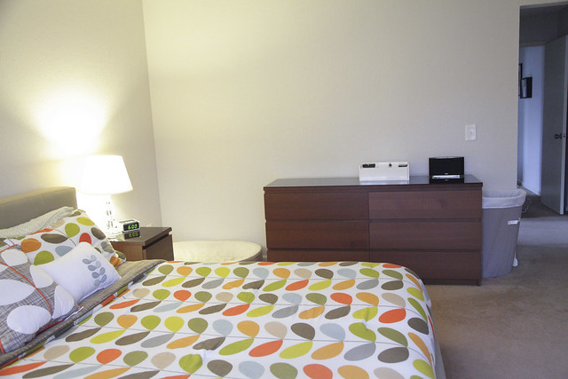
We later discovered we couldn’t do this for a couple reasons, the big one being that we couldn’t face the dresser because of the location of the floor vent.

I spent some time this weekend looking at other bedrooms for ideas, cranked out some sketches, and brainstormed with Joshua. After discussing all the possibilities, here’s what we came up with.


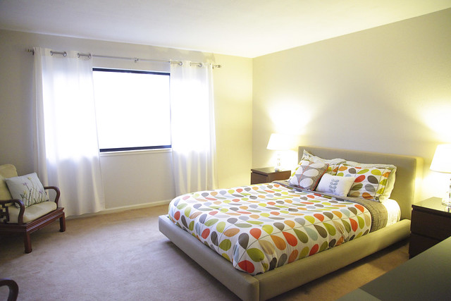
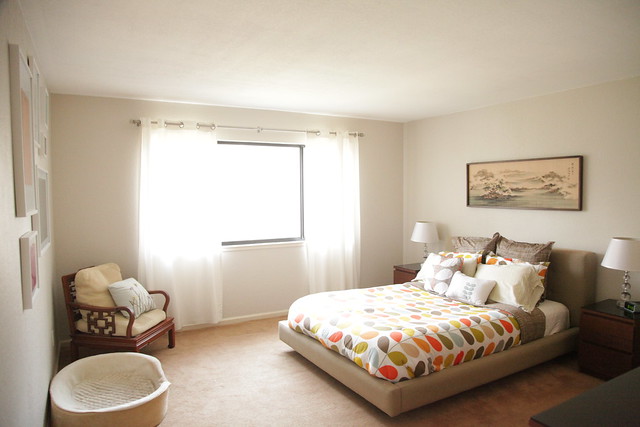
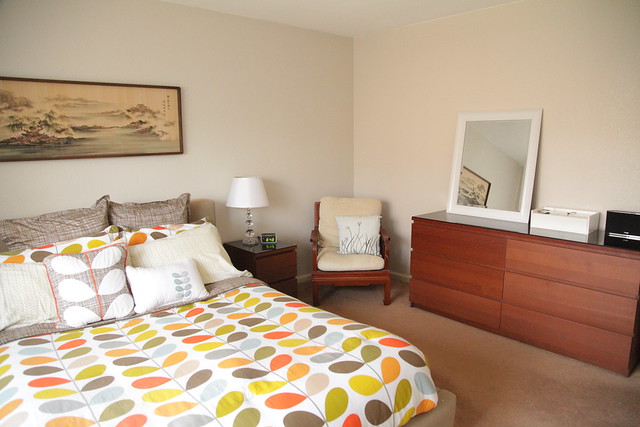
We simply moved one of the chairs into the corner where Tucker’s bed used to be and moved the bed and nightstands closer towards the window. Who knew that moving one chair could make such a difference?
I picked up a few accessories from HomeGoods, and I moved my painting above the sofa in the living to the bedroom. I’ll probably do a bit more accessorizing on the dresser, but for now I’m pretty happy with how it’s looking.
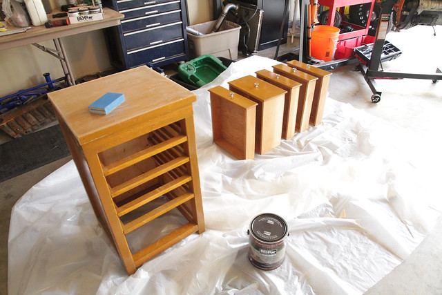
In addition to rearranging the master bedroom, I began painting the nightstand in the guest bathroom. After seeing John & Sherry’s gradient dresser on Young House Love, I thought it would be a fantastic idea for my nightstand.

The nightstand was originally left behind in the garage by the previous homeowners. I knew it had potential, so I hung onto it with the intention of dressing it up with some paint and accessories. I’m hoping to have it done in the next few days.
You Might Also Want to Read...
