6 Ways to Optimize the WordPress Admin for Users
Customizing the WordPress Admin for Better User Experience
At my previous agency job, I wore many hats, one of which was project manager. I ended up being responsible for training the clients on WordPress as well as handling questions, fixes, etc. before and after the process.
In an effort to improve client satisfaction and cut down on the number of emails I received, I started looking at ways I could make the WordPress admin work FOR me. I began experimenting with different tactics and eventually put together a process that not only gives me peace of mind but empowers my clients. That process is what I’m sharing with you today!
Why should I care about the WordPress Admin?
Real talk: it horrifies me when a WordPress site is handed off to a client with no optimization done to the admin. It’s such a disservice to the client. They’re relying on you to be the expert (that’s why they’re paying you the monies 💵), and when you don’t give them 100% it hurts the value of the product. We need to be doing better!
WordPress Can Be Intimidating
We as designers and developers are so used to working with WordPress that we tend to forget what it’s like from the point-of-view of someone who has never used it before. It’s intimidating, especially when there’s plenty of out-of-the-box stuff that isn’t applicable to them.
Think back on your very first time using WordPress. There was a lot to process! We have to keep in mind that’s what it’s like for most of our clients. If you show them everything, they’re not going to know what’s applicable to them and what isn’t, so they might end up focusing on the parts of their site that can get them into trouble. Knowing this, we need to make sure we’re putting what matters in front of them.
Clients Can Break Things
With free reign to a foreign site, clients can start getting themselves into trouble. They may start running updates, mess with critical settings, and break the theme. Anybody that’s familiar with these kinds of “user errors” knows that fixes for this can be frustrating and time-consuming.

Ask yourself, “Do you want to fix it now or fix it later?” Whether you like it or not, these problems are inevitable without giving the admin a little TLC. Imagine how many emails could be answered simply by the site you created.
Put Your Best Foot Forward
As creators of WordPress sites, it’s our duty to provide a user-friendly experience both on the frontend as well as the backend.
By taking the time to optimize the admin, you’ll reduce the number of emails you receive from clients, and they’ll be even more satisfied with the end product adding value to what you’ve created. Not to mention, it’ll make you stand out amongst your competition. Who wouldn’t want that?
01. Define User Roles and Capabilities
One of the first things I do when I begin the process of setting the site up for the client is I get in touch with them and verify who needs access. Sometimes it’s one client, other times it’s multiple, but it helps to know who will need access and to what areas of the site.
Once I know who needs access, I put together a basic spreadsheet that has the names, emails, passwords, usernames, and roles of the users on the site. I’ll usually create their username using the first initial + their last name, and I’ll generate a strong password.
Create a Custom User Role
I know there are people in the camp of giving users access to everything, but I’m a firm believer in giving them access to the right things.
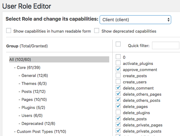
By default, WordPress has several user roles built-in, but I like to take it a step further and create a custom one for my client. This helps in giving them the access and capabilities strictly to the things they need. I do this via the User Role Editor plugin.
I’ll create a custom role based on the default WordPress Administrator role and then reduce capabilities from there. I usually call this role “Client” to keep things simple.
Restrict Access to Various Areas
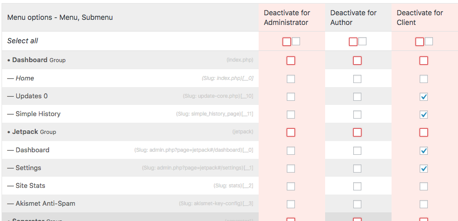
Next, I use a plugin called Adminimize which allows you to restrict access to different items and areas of the site based on role. I’ll use this to hide areas such as unneeded Dashboard widgets, Updates, Appearance, Plugins, Tools, and Settings AKA areas where a client can get into trouble if they don’t know what they’re doing.
Create and Test Logins
The last step before training a client is I’ll create their logins, assign them to the custom role, and then test their login with the User Switching plugin. This is to make sure that their roles are working as they should. The plugin lets you quickly switch back and forth between users making it super easy for testing.
It’s also a fantastic plugin to keep on hand if you need to troubleshoot down the road and the client has changed their password.
02. Streamline the Dashboard Widgets
As mentioned earlier, I’ll use Adminimize to clean up Dashboard widgets that aren’t necessary for the client. This includes the At a Glance, Quick Draft, WordPress Events & News, and any other plugin-related widgets (like Yoast SEO). Instead, I’ll replace them with ones that are helpful.
Create a Personalized Custom Widget
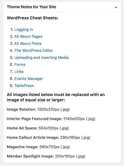
Every build of mine always includes a custom dashboard widget. I’ll put in notes about their theme, links to documentation (I’ll get to that later), image sizes, the process for contacting when problems arise, and any other resources I think are handy. It’s a classy personal touch that adds value big time.
Google Analytics Dashboard Widget
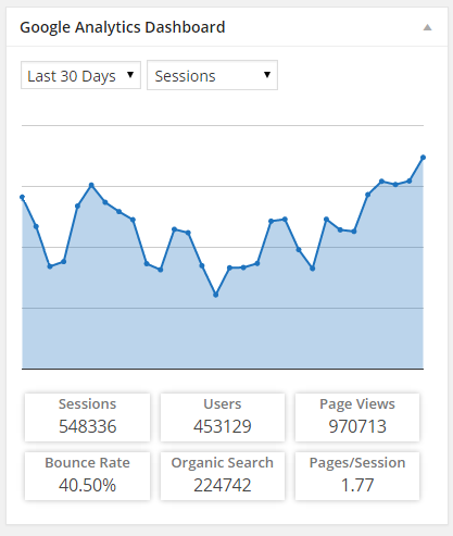
Google Analytics is a must-have for every website, and one of the easiest ways to implement it is through a handy plugin called Google Analytics Dashboard for WP.
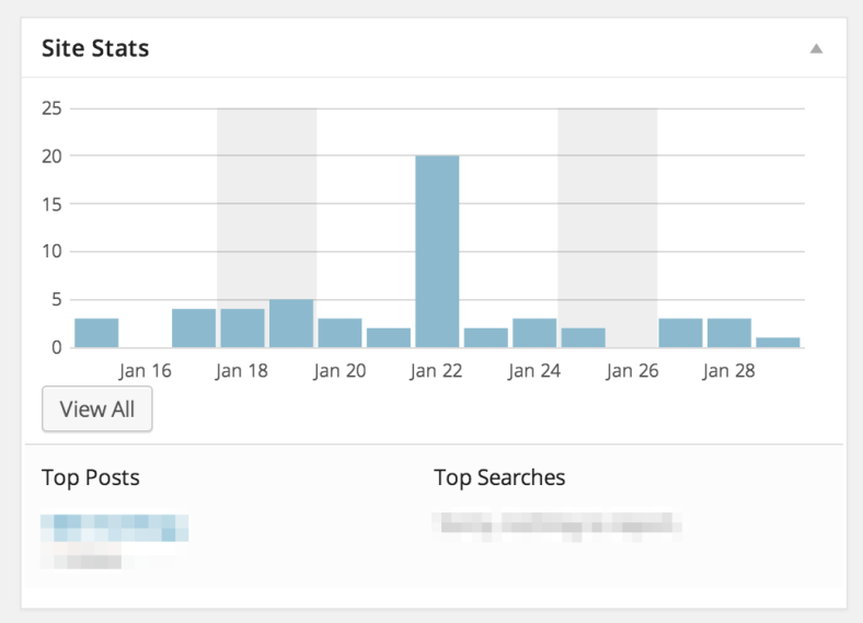
Not only does it put the tracking code in for you, but it adds a Dashboard widget that presents your stats in an easy-to-digest format. You can even customize the data colors to match the color scheme of your site.
This is helpful for clients who want a quick view of their site stats. Clients love to see how their site is doing, and this widget makes it super easy for them to review their stats without being overwhelmed.
Optional Widgets
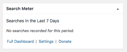
A few other optional widgets I like to throw in depending upon the build are Search Meter and Jetpack.
Search Meter: If a client has a search bar on the front end, this plugin allows them to see what their visitors are searching; this can be especially useful for content strategy.
Jetpack: This is an all-in-one plugin jam-packed full of functionality by the makers of WordPress.com. I find their traffic and stats tools to be most helpful alongside Google Analytics. You can see top posts and get insights about your most popular content.
03. Utilize the Advanced Custom Fields Plugin
Advanced Custom Fields is an amazing plugin that takes the concept of WordPress’s native custom fields to the next level. I use it on almost every project, and it’s great for making content easier to edit. There are a few additional ways I use it that help with admin optimization process.
Create an Options Page
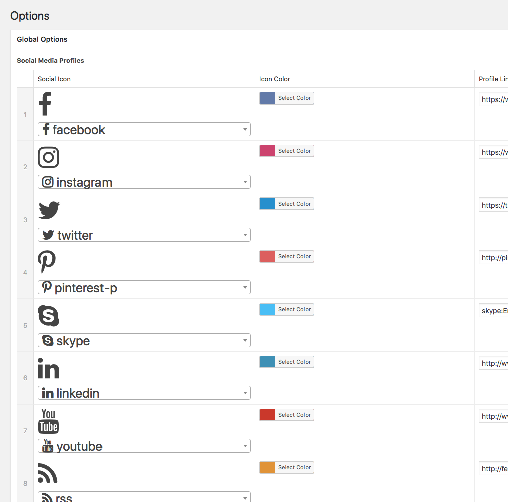
Think of this as your own custom Settings page tailored for your client’s specific needs. This is a great place to add abilities to update their logo, contact information, and other information you’d think they’d want a little more control over. You can even create an area dedicated for pasting items that would go between the <head></head> tags like tracking pixels, Typekit fonts, etc. or in the footer, areas that would normally be accessed directly through code.
On one of my client’s sites, I’ve utilized the Font Awesome add-on to give my client the ability to add or remove the social media icons that appear throughout her site. She can control the icon, the color, and the link all in one spot.
Users are accustomed to looking for some kind of Settings or Options area, so by creating a custom one (and restricting access to the main one) you’ll be able to better anticipate their needs and keep them out of trouble.
Create Notes and Reminders
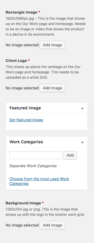
When creating a new field in ACF one of the fields that come up is an Instructions field. This is a perfect opportunity to educate your users and guide them to more successful content population.
For example, if it’s an image field you can add notes about what size/format the image should be, where it will show up on the frontend, and anything else they should know. Little things like that are tremendously helpful for clients. It’s one less question they have to ask you!
You can also hide certain items on the page and create reminders on where to go. Let’s say your blog is not the homepage, so you have a separate page called Blog. Your client might forget they need to go to Posts to populate their content and instead go to the Blog page. An easy mistake, especially for the WordPress novice.
With ACF you can create a field group targeted specifically for that page, hide things like the Content Editor on that page, and add a note to remind them to go to the Posts section of their site.
04. Make WordPress Easier to Use
I went over several ways to do this in my 2016 talk on Best Practices for Creating Content, but one of the best things you can do is making sure your site build is setting your clients up for success.
Style the Visual Editor
Out of the box, the Visual Editor is black and white leaving very little to be desired. Sadly, most clients are copying and pasting their content from some kind of word processor, which means they’re making styling choices prior to editing their site directly.
Style the visual editor and they’re less likely to play designer. To do this, simply add a function to your functions.php file to activate the editor stylesheet. Use the inspector to bring in additional classes to format. Here’s mine:
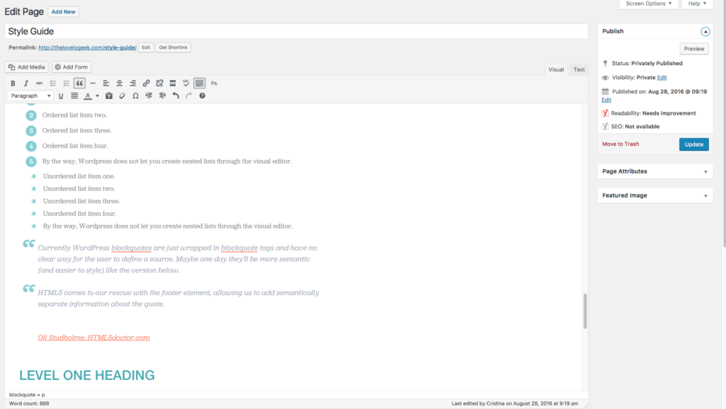
Furthermore, create a private page/post called Style Guide and populate it with content from WPFill.me. This gets you all the possible content your client could put in the editor and lets you see everything you’d need to style. It’s an easy way for clients to reference styles so they don’t have to come up with their own.
User Friendly Editing
I believe a client should be able to edit all the content on their site without knowing code. If we’re taking advantage of WordPress’ native functionality like the Theme Customizer, Widgets, and Custom Fields then it makes this simple and efficient. Pair this with the use of Advanced Custom Fields (and good training) and your client will be able to maintain their site with ease.
05. Anticipate Future Errors
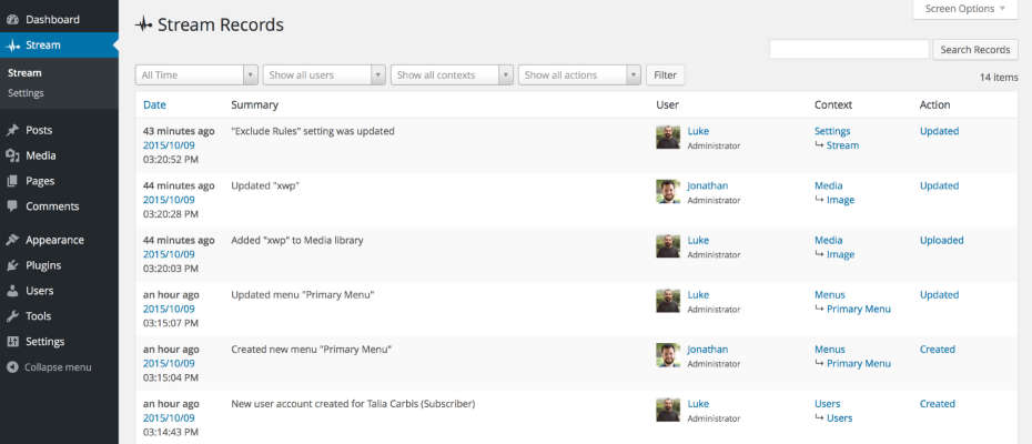
“When something goes wrong, you need to know how it happened.” This is the tagline for one of my favorite activity monitor plugins, Stream.
Let’s face it, you can do all the things I suggest in this post, but there are going to be issues that you just can’t predict. That’s where having an activity monitor plugin comes in to play. It may seem a little “big brother” and perhaps it is, but you’re ensuring you have a starting point when troubleshooting future issues.
With an activity monitor plugin, you’re able to see who is logging into your site and what they are doing. They track almost every type of activity, so if your client commits a questionable oops, you know where to go and hopefully how to prevent it from happening again. It’s an opportunity to not only troubleshoot more efficiently but find areas of improvement within your site.
Having a plugin like this has greatly improved my overall process for optimizing the admin. I’ve been able to see user habits, how they would get from point a to point b, and use that data to improve their experience.
My top favorites are Stream, Simple History, WP Security Audit Log. I recommend activating this plugin after you train your client but before you give them access. That way the logs aren’t cluttered from all the training activity. Then you can use Adminimize to hide access from your clients.
06. Train Your Client Before Giving Them Access
Training your client on how to use their site is crucial for a successful project. At the very least schedule one training session, if not more depending upon the project and client’s comfort level.
By training your client on their site you have the opportunity to educate them on best practices and set expectations. Show them how to log in using the credentials you’ve created for them (not your super admin access). Review with them the various ways you’ve optimized the admin. Show them where to go for help.
Create Documentation
I once worked for a boss who when asked by a client for help with their WordPress site he simply told them to visit the WordPress.org Codex. That is horrible customer service and should never happen.
For most clients, this is their first time managing a website. They’re not used to interacting with WordPress on a daily basis like we are. When we train them, there’s a lot to cover and it’s so easy to forget things. Creating some basic documentation (cheat sheets) to accompany your training can go a LONG way!
I put together a handful of training documentation in Google Docs so that way I can link to them in the custom Dashboard widget, making it part of my build. You don’t need to cover every aspect of WordPress, just the basics, like Logging In, Pages, Posts, the Editor, Uploading and Inserting Media, Forms, and documentation for commonly used plugins.
Brand your cheat sheets and revisit them whenever there is a major WordPress release so the content is up to date. Remember, this is all new to your clients, so the more you can give your clients up front the better it is for everyone.
Putting it All Together
I know I’ve covered a lot, and you may be wondering how to get started with all of this. Well, you’re in luck! I’ve put together a fabulous checklist to keep handy when implementing these solutions on your website.
It’s a lot to do, but it makes a huge difference for your users. User experience is more than just a pretty website.
Clients don’t intentionally mess up a site. We need to anticipate what may go wrong and do our best to prevent catastrophes from happening. I’d rather a client reach out to me and ask me how they can edit something rather than having me fix something because I gave them the platform to mess it up. It’s a more positive experience.
Plugins Mentioned
- User Role Editor
- Adminimize
- User Switching
- Google Analytics Dashboard for WP
- Search Meter
- JetPack
- Advanced Custom Fields
- Advanced Custom Fields: Font Awesome Field
- Stream
- Simple History
- WP Activity Monitor
Additional Reading
- Power Up Your Users With The User Role Editor Plugin
- Two Approaches For Optimizing WordPress Backend For Clients
- 9 Ways to Protect Users and Clients from Breaking Their WordPress Site
- 22 Tools That Infinitely Improve the WordPress Admin
WordCamp Slides
You Might Also Want to Read...

Note: This article may contain affiliate links. I only link to products that I know, love, and use. For more info, please view my disclaimers.
JOIN the LIST
Subscribe and stay up to date with the latest blog posts.
JOIN the LIST
Shop My Posts
Want to know where I get #AllTheThings from my blog or Instagram posts? Find what you're looking for below (or just ask).
LIKETOKNOW.IT
Amazon store

Your talk at WordCamp yesterday was fantastic. I am impressed with the strategies you’ve come up with and will be utilizing them myself, without a doubt. Thank you!